Maria Stegner
Product Designer | maria.stegner@gmail.com
About the project
SitterHub is an iOS app that I designed during my User Experience Design class at General Assembly. The app helps working parents find and book last-minute babysitters, and relies on reviews and ratings from each user's social media connections to recommend reliable caregivers nearby. The app solution was based on a thorough interview- and survey-based investigation into the lack of easy ways for working parents to find backup childcare in a pinch.
The Problem
Many working parents living in New York have a problem finding reliable, last-minute childcare when their child is too sick to go to school; their regular sitter calls in sick; or something else comes up unexpectedly. These parents often rely on calling or texting friends and neighbors, desperately trying to find someone to take care of their child so they can get to work. Sometimes they find a last-minute childcare solution, but often they end up having to take a sick day and stay home from work.
The Solution
SitterHub app would allow busy working parents to quickly find reliable, trustworthy babysitters that are located nearby and are recommended by other local mom/dad friends who they know and trust.
User Research - Survey
I designed a survey about finding last-minute childcare, and asked my friends on Facebook and my neighborhood bulletin board to take it. As an incentive, I offered to buy every survey-taker a beer, and 83 people took my survey :)
Here are some key stats that I distilled about my app's potential users:
92% are women
69% are between 36 and 45
92% live with spouse or partner
90% have 1 or 2 kids
88% have kids 2-7 years old
86% work full-time away from home
89% rely on regular babysitter or daycare
User Interviews and Survey Insights
In addition to the survey, I conducted six in-depth user interviews with working moms and dads. Each family’s work/life situation is different, but virtually everyone I spoke with shared their frustration with the lack of a good system in place for finding quality childcare in a pinch. These parents said they often resort to frantically texting, emailing, or calling a handful of friends or neighbors, hoping to find someone to care for their child so they can get to work. Between the survey and the interviews, the main concern that was expressed by the users was trust: they want to be able to find a last-minute caregiver they can trust, based on recommendations from close friends and neighbors.
Here are some actual quotes from my interviews and the survey:
Persona Creation
Based on all my research from the survey and user interviews, I created my persona, Margaret, in order to help me visualize my app's main user, her habits, motivations, and needs.
User Flow - ‘Happy Path’
In order to start mapping out the main user flow, I sketched out the happy path of a user searching for, finding, and booking a babysitter. Here are two versions of the "happy path" user flow (original sketch, and more complete diagram):
Site Map
With the user flow in place, I created the site map for both the working parents (looking to hire a babysitter) and the babysitters looking for a job. A third leg of the flow includes the hamburger menu with options for posting a job, creating a profile, saving bank information, looking at the user’s social network connections, and other related tasks.
Paper Prototypes
I sketched out the key screens and features. I scanned these drawings and brought them into the POP app for a quick test with my classmates, in order to see gaps in functionality and flow.
After testing these on my classmates, we identified some features that were missing, so I went back and fleshed out several new screens. This particular flow is for a parent looking for, and booking a babysitter through the app.
Wireframes
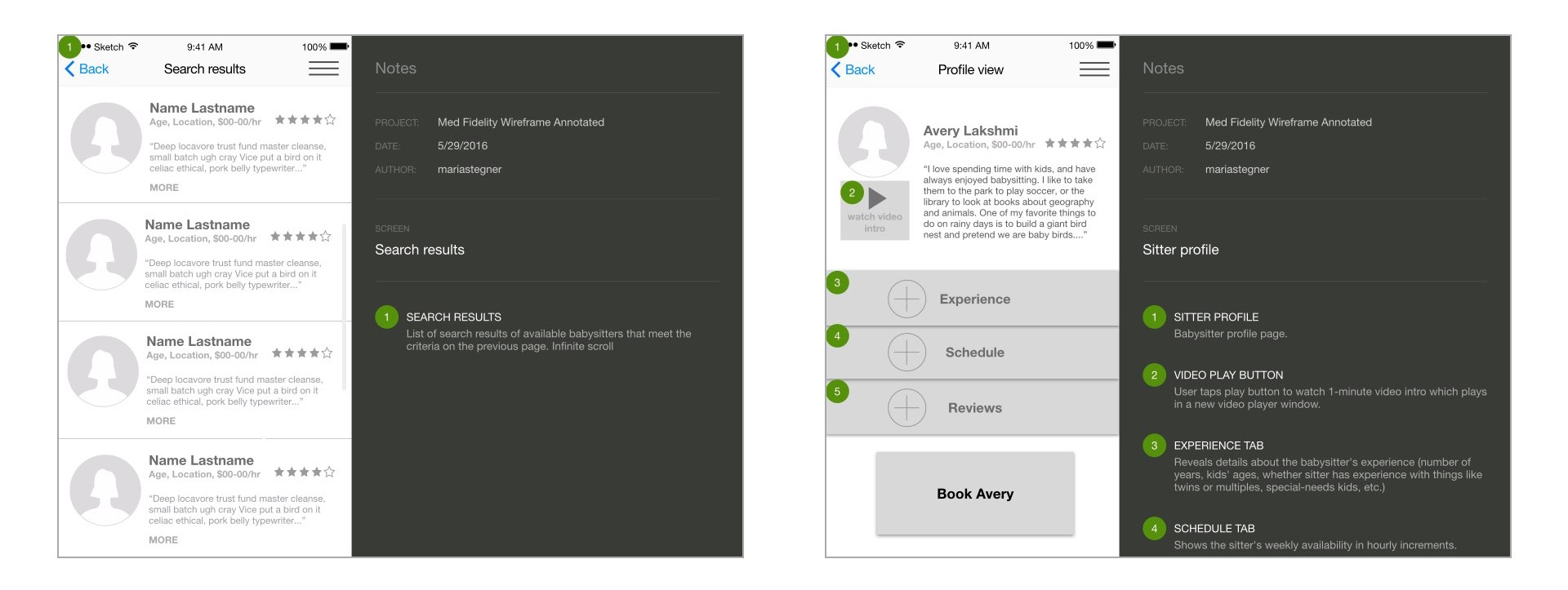
I created medium-fidelity wireframes in Sketch, and added annotations to help identify each feature’s functionality and behavior. In thinking about the user, it was important to keep the features and gestures as simple as possible in order to help the user complete their task as quickly as possible.
Visual Design
I went through four iterations on the visual design in order to come up with a look and feel that felt right for the product, testing each iteration on friends and colleagues, and making incremental changes along the way.
Usability Testing
For the usability testing, I got seven volunteers to test my app and provide feedback. I asked each person to complete tasks such as searching for and booking a sitter, updating their profile, looking for help. Unsurprisingly, some of my assumptions were wrong, and it was a humbling experience to watch each tester struggle with some of the tasks.
Here is a summary of the key takeaways from the testing:
Delightful things
-easy to use, efficient, intuitive
-Facebook friend integration very popular
-babysitter intro video
Painful things
-calendar too fussy- needs to be simpler
-pay rates - show more options or a slider
-how to confirm if sitter is available?
-need some way to interact with sitter before booking
-concern with paying ahead of time
Next Steps
The usability testing provided me with some great feedback for the app’s next iteration:
Nearly everyone objected to only being given 3 options for the babysitter’s hourly pay rate. Rethink the pay rate scale.
My testers also didn’t like the idea of having to book a sitter without first getting in touch with her ahead of time. Provide a way for user to contact sitter first, before booking.
Testers did not like having to pay the babysitter’s fee ahead of time. Allow booking a sitter and paying for the service separately, after the sitter is done with the work.

